LaCroix Water - Website Re-design
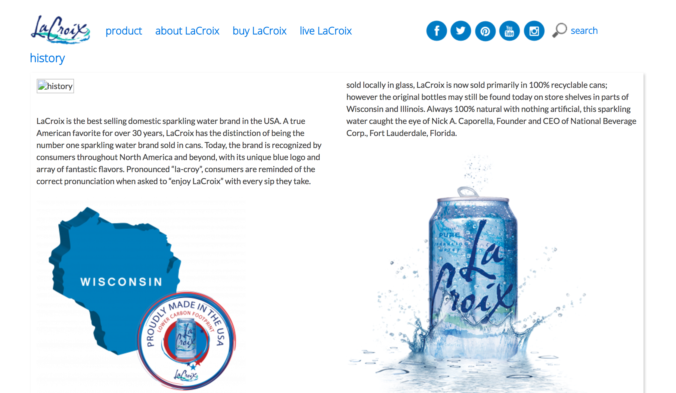
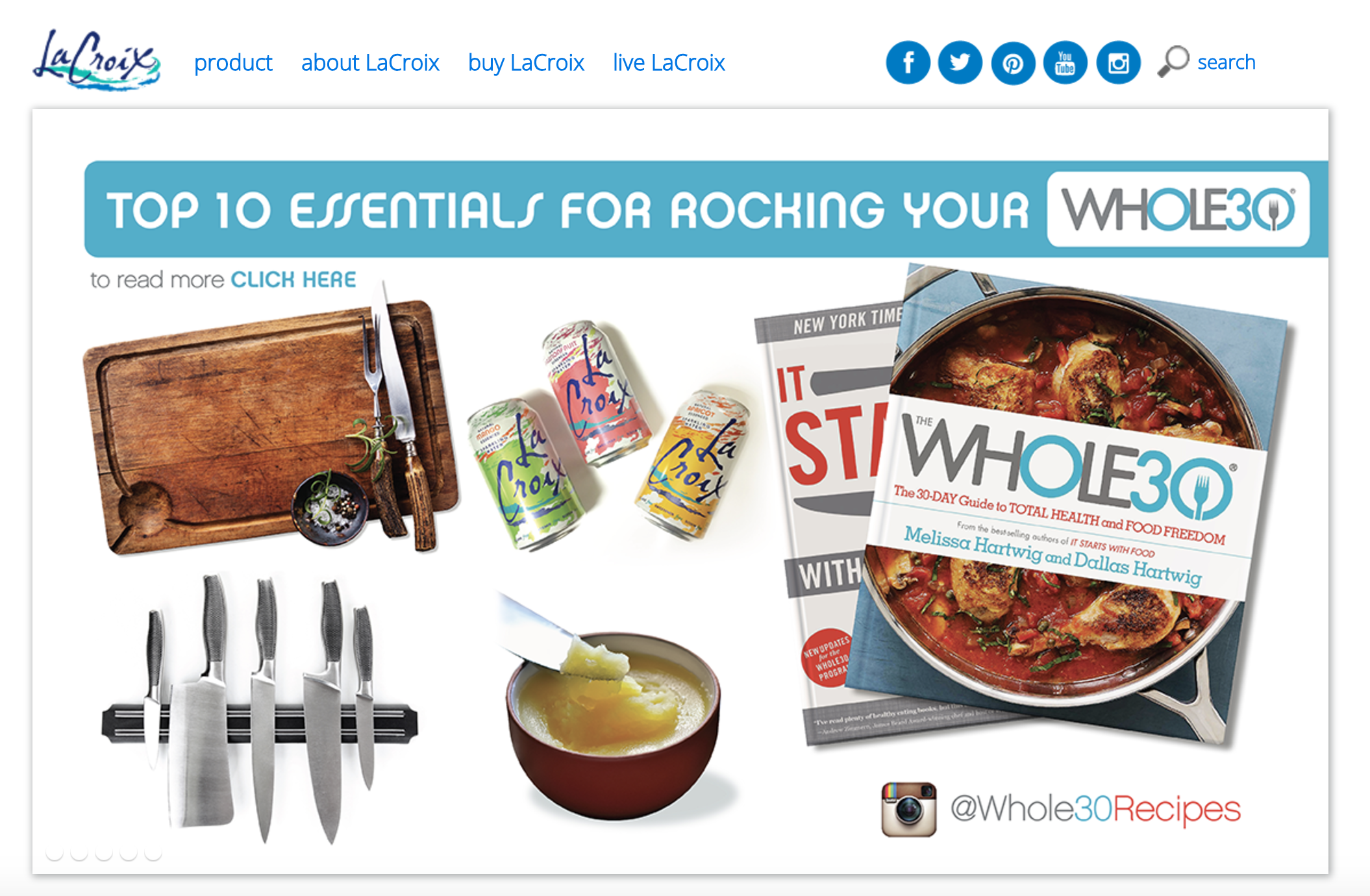
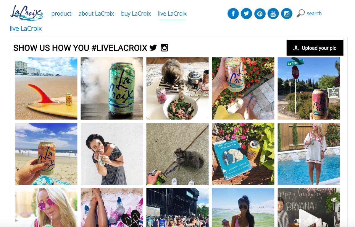
For this comprehensive project I wanted to re-design the LaCroix website since at the time it did not reflect the brand’s energy and objectives. I wanted to share LaCroix’s personality through every page making it enjoyable to look at and easier to navigate. You can see screen captures of the older version of their website below.
This was a responsive site made with custom HTML5, CSS3 and JavaScript.
This website re-design was a school project created in the Spring semester of 2019. Since then, LaCroix has re-designed their website which launched at the end of 2019.
I was just a little too late to aproach them with my ideas.
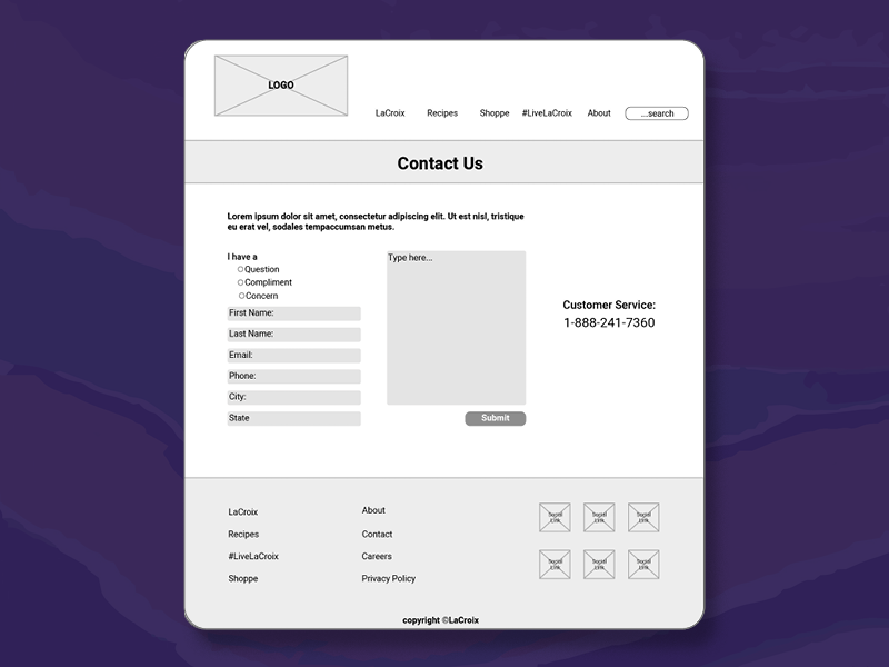
Sample Wireframes:
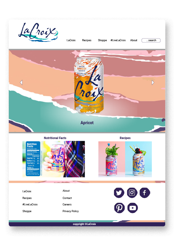
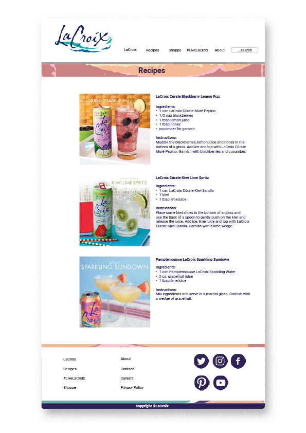
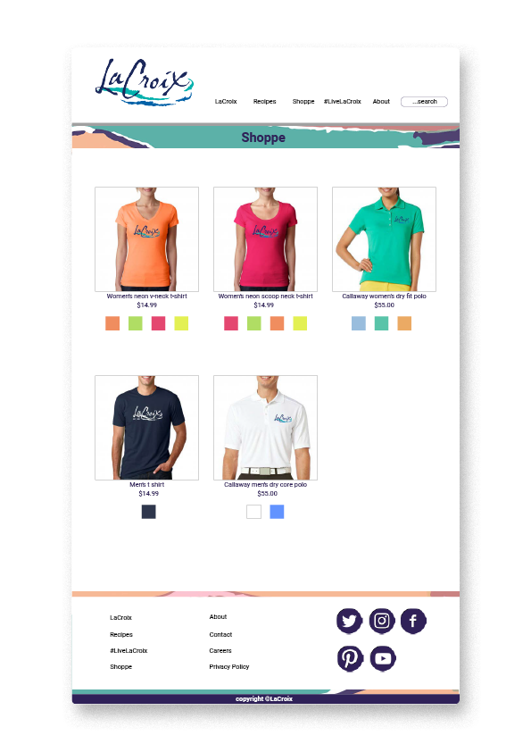
Sample Final Layout:


